How to Calibrate a 4K Monitor for Accurate Color (Free Tools Included)
Calibrate your 4K monitor in 15 minutes using free tools. Brightness, color temp, gamma settings that actually make a difference.
Written by the SolderMag Editorial Team. We update recommendations against current product availability, disclose affiliate links, explain ranking criteria in our testing methodology, and correct material errors through the contact page.
As an Amazon Associate I earn from qualifying purchases. Product prices and availability can change.
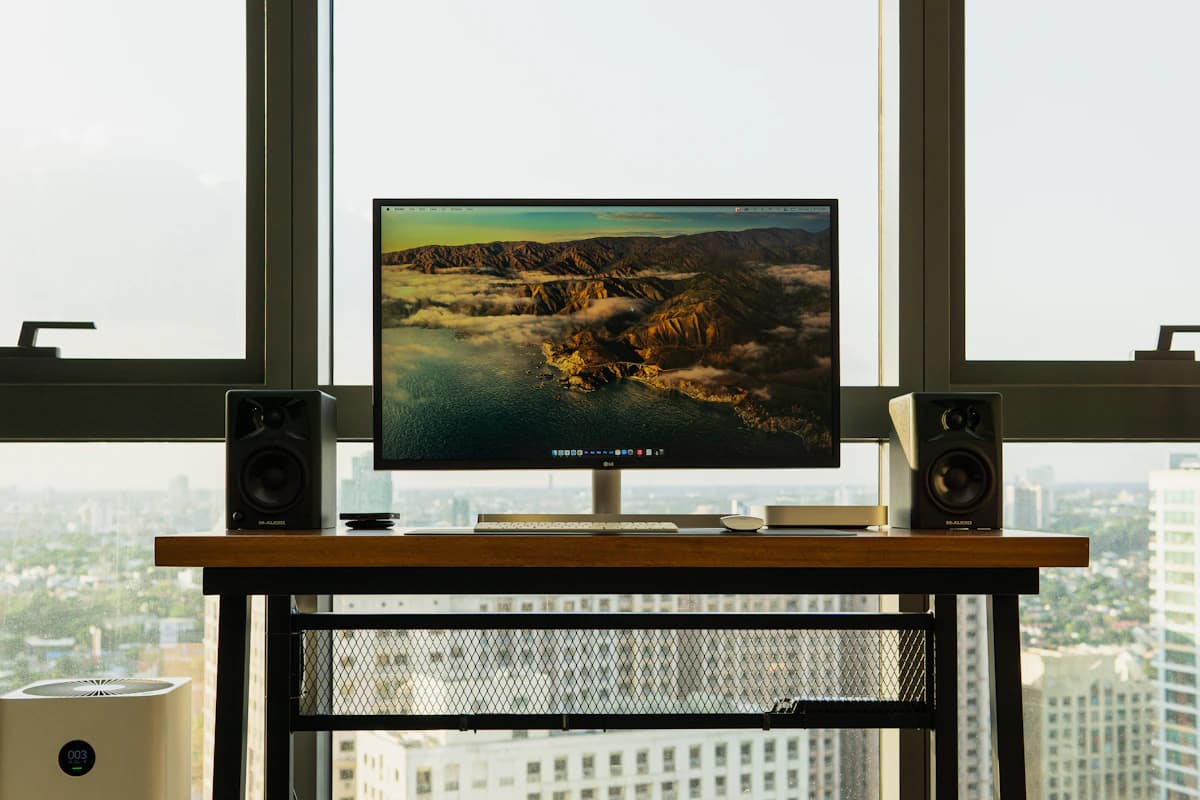
Most people spend hours researching which 4K monitor to buy and then never calibrate it. The monitor arrives, they turn it on, and they use whatever factory settings it shipped with. Those factory settings are almost always wrong.
The good news: basic calibration takes about 15 minutes, costs nothing, and makes a visible difference in color accuracy, eye comfort, and overall image quality. You do not need a $200 colorimeter for everyday work. You need a few free tools and a willingness to change some settings.
Why factory settings are usually wrong
Monitor manufacturers calibrate for the showroom floor, not your desk. Factory presets tend to crank brightness to maximum, push color temperature toward a cool blue, and boost saturation so the display "pops" next to competing models on a shelf.
The result: colors that look artificially vivid, whites that skew blue, and a brightness level that causes eye strain during long work sessions. Your photos look more saturated than they are, your text has a slight blue tint, and dark content loses shadow detail. If you have not chosen a monitor yet, our best 27-inch 4K monitors guide covers panels with better factory calibration out of the box.
A 15-minute calibration fixes most of this.
What you need
Free software tools (pick one):
- Windows: Built-in Display Color Calibration (search "Calibrate display color" in Settings). For more control, download DisplayCAL (free) or use the Lagom LCD test pages in your browser.
- macOS: Built-in Display Calibrator Assistant (System Settings, Displays, Color Profile, Customize). Also use the Lagom LCD test pages for visual reference.
- Browser-based (any OS): Lagom LCD monitor test pages (lagom.nl/lcd-test). No install required.
Hardware you probably already have:
- Your monitor's physical buttons or OSD remote
- A room with your typical lighting conditions (calibrate under the light you actually work in)
Optional but nice:
- A colorimeter like the Calibrite ColorChecker Display or X-Rite i1Display for professional-grade accuracy. Not necessary for general use, but worth it if you do photo or video editing for clients.
Step 1: Set brightness correctly
This is the single most impactful adjustment. Most monitors ship at 80% to 100% brightness. For a typical office or home workspace, you want much less.
Target: 120 to 160 nits for a normally lit room. If your room is dim, go lower (80 to 120 nits). If you sit next to a window with direct sunlight, you may need 200 nits or more.
How to set it without a meter:
- Open a full-screen white image or blank document
- Hold a white sheet of paper next to your screen
- Reduce your monitor's brightness until the screen roughly matches the paper's brightness under your room's lighting
- If the screen looks noticeably brighter than the paper, keep reducing
This paper test is surprisingly effective. Your eyes adapt quickly to lower brightness, and after 30 minutes you will wonder how you ever worked at 100%.
Step 2: Adjust color temperature
Color temperature controls whether whites look warm (yellowish) or cool (bluish). Factory defaults tend to run cool, around 7000K to 9300K.
Target: 6500K (D65). This is the standard reference white point used by sRGB, web content, and most media. It looks neutral to slightly warm compared to factory settings.
How to set it:
- Open your monitor's OSD (on-screen display) using the physical buttons
- Find the Color Temperature or White Balance setting
- Select 6500K if it is an option, or select "Warm" if numbered options are not available
- If your monitor has RGB gain controls, you can fine-tune: reduce Blue slightly and leave Red and Green at their defaults
After changing this: Everything will look slightly yellow for about 10 minutes. This is your eyes adjusting from the artificially blue factory setting. After adjustment, the new setting will look natural.
Step 3: Set gamma correctly
Gamma controls how your monitor maps brightness values between black and white. Wrong gamma makes shadows either crushed (too dark to see detail) or washed out (flat and grey).
Target: Gamma 2.2 for Windows, gamma 2.2 for macOS (macOS used to default to 1.8 years ago, but 2.2 has been standard since OS X 10.6).
How to test gamma:
- Go to the Lagom LCD gamma test page (lagom.nl/lcd-test/gamma_calibration.php)
- You will see a series of colored bars. Sit at arm's length from your monitor
- Squint or step back. Each bar should blend with its background at the correct gamma value
- If the bars blend at the 2.2 row, your gamma is correct
How to adjust if it is wrong:
- Check your monitor's OSD for a Gamma setting and select 2.2
- On Windows, the built-in Display Color Calibration tool has a gamma slider
- On macOS, the Display Calibrator Assistant walks you through gamma adjustment
Step 4: Adjust contrast
Contrast is simpler than brightness or color. The goal is to avoid clipping.
How to test:
- Go to the Lagom LCD contrast test page
- You should be able to distinguish the darkest squares (near black) and the brightest squares (near white)
- If the darkest 2 to 3 squares all look identical, your black level is crushed. Reduce contrast or increase brightness slightly.
- If the brightest squares merge into white, your contrast is too high. Reduce it until you can see distinct steps.
Most monitors are fine at their default contrast setting (usually 50% to 80%). Only adjust if the test reveals clipping.
Step 5: Verify with test images
Run through a few quick visual tests to confirm your calibration looks right:
Gradient test: Display a smooth gradient from black to white. It should transition smoothly without visible banding or sudden jumps. Banding usually means your color depth or gamma needs attention.
Skin tone test: Open a few photos of people (a quick image search works). Skin should look natural, not orange, not grey, not overly pink. Skin tones are the most revealing test of color accuracy because your brain is extremely good at detecting when they look wrong.
Text clarity test: Open a text document and check that black text on white background looks crisp and neutral. If text has a color fringe (pink, green, or blue edges), check your subpixel rendering settings (ClearType on Windows, font smoothing on macOS).
Step 6: Create and save a color profile
Once you are happy with the results:
Windows:
- The built-in calibration tool saves an ICC profile automatically
- Confirm it is active in Settings, System, Display, Advanced display, Color profile
macOS:
- The Display Calibrator Assistant saves a custom profile when you finish
- It becomes the active profile automatically
- You can switch between profiles in System Settings, Displays
Why this matters: If you reset your monitor or update your graphics driver, you can reload your profile instead of recalibrating from scratch.
When free calibration is not enough
For most people doing general office work, coding, web browsing, and casual photo editing, visual calibration with free tools is perfectly adequate.
You need a hardware colorimeter if:
- You edit photos or video professionally and clients depend on color accuracy
- You do print work and need to match screen to paper
- You work across multiple monitors and need them to match each other precisely
- You calibrate for specific color spaces beyond sRGB (Adobe RGB, DCI-P3)
A decent colorimeter (Calibrite ColorChecker Display) runs about $120 to $180 and takes the guesswork out of calibration entirely.
Monitor settings that do not need calibration
Sharpness: Leave at default or one tick below default. Oversharpening adds ugly white halos around text and edges. On a native 4K panel at 27 inches, sharpness is inherent to the pixel density.
Dynamic contrast: Turn it off. It adjusts contrast on the fly and creates inconsistent brightness that makes calibration pointless.
Eco/power saving modes: Disable during calibration. These modes reduce brightness unpredictably.
HDR: Calibrate in SDR mode first. HDR has its own tone mapping and should be configured separately if your workflow requires it.
Bottom line
For most 4K monitors, the useful calibration path is simple: use the correct picture mode, set brightness for your room, keep dynamic contrast off, and save an ICC profile. A hardware colorimeter is worth buying only when color accuracy affects paid work or print/video output.
Further reading
If you are still choosing a monitor, our best 27-inch 4K monitors roundup covers the panels worth buying. A good monitor arm puts the screen at the right height, which matters almost as much as calibration for eye comfort. And for the full workspace picture, our desk setup essentials guide covers everything from chair ergonomics to lighting.